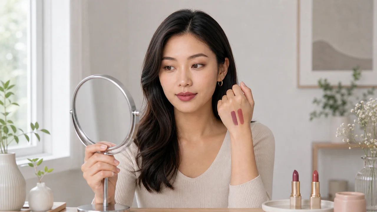
A lipstick can look different across people because of natural lip color, skin depth, lighting, and base coverage. Undertone is best used to narrow a palette, not to assign a permanent label.
Separate skin depth from undertone
Skin depth can change with sun exposure, foundation, and camera exposure. Undertone describes a cooler, warmer, or more neutral color tendency. Do not rely on one selfie or one popular test.
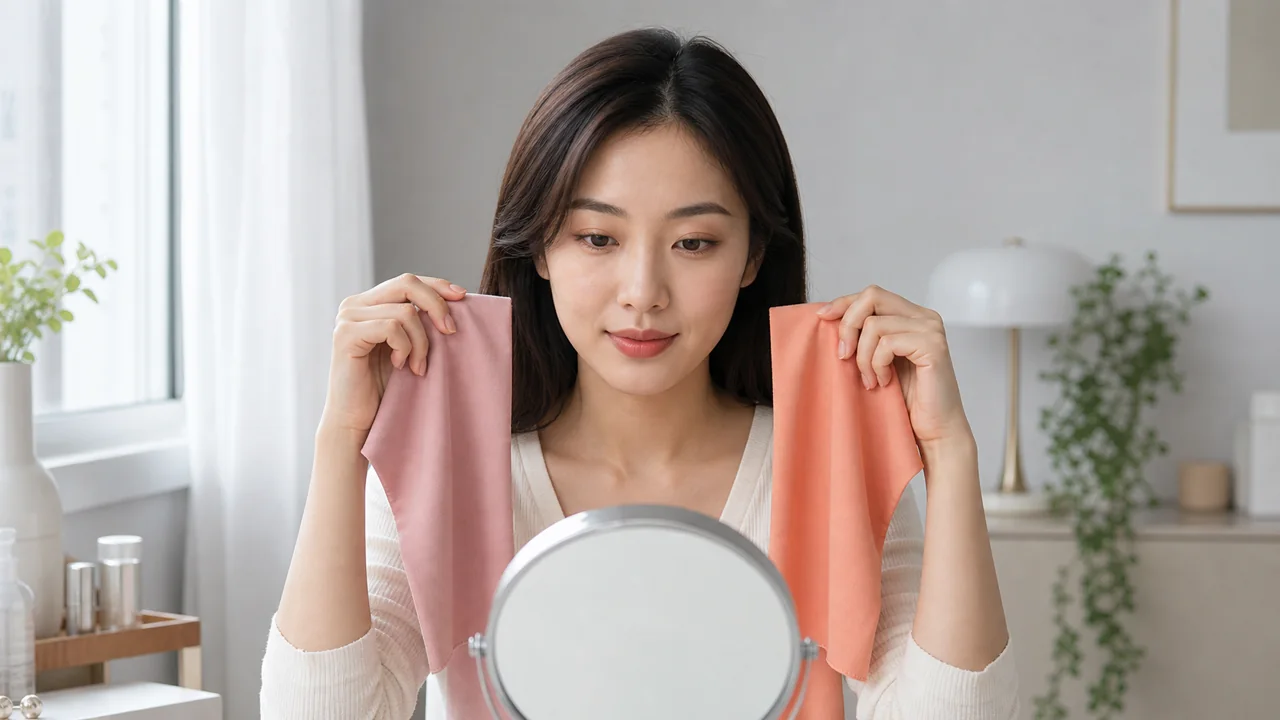
Run a low-distraction comparison
- Use soft window light and turn off strong warm or cool lamps.
- Remove saturated makeup and wear neutral gray or white.
- Compare soft rose with soft coral, then silver with light gold near the face.
- Repeat on another day before drawing a conclusion.
Turn the observation into choices
If cooler colors look more balanced, start with muted rose, berry, or taupe. If warmer colors look more balanced, start with peach, coral, or warm brown. Neutral tendencies often allow a wider range.
A more useful success test
A suitable color usually lets the face and overall expression register before the makeup itself. The goal is a reliable range, not one perfect answer.
Build a three-photo comparison set
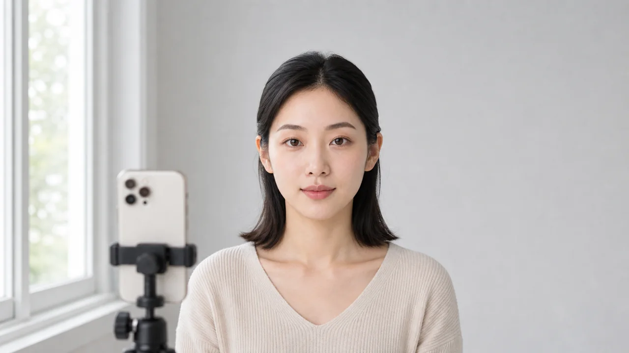
Use one bare-face photo, one photo with a cool rose or berry direction, and one with a warm peach or coral direction. Keep the same window light, camera distance, and shirt color. This turns undertone from a vague label into evidence you can compare later.
Turn the result into a shopping rule
Do not buy only because a shade name says warm, cool, or neutral. Compare depth, saturation, and finish as separate variables. A muted warm shade can look calmer than a bright cool shade even on someone who usually prefers cool colors.
- Choose one daily lip-cheek family and one higher-contrast option.
- Check both in daylight and indoor evening light.
- Save the photo set before trying new products, so the next comparison has a baseline.
If a color family keeps failing, change only one attribute at a time: make it softer, deeper, warmer, cooler, or less glossy. This prevents a broad conclusion such as "I cannot wear red" when the real issue may be brightness or finish.
For a narrower color test, use the method in How to compare lipstick colors. If you want to see complete directions instead of isolated colors, compare soft rose, peach, and muted brown options in the look library.